

Color is a powerful tool in design, influencing emotions, perceptions, and even decision-making. Whether designing a logo, website, or marketing materials, choosing the right colors can make a significant impact on how your brand is perceived.
1. The Emotional Impact of Colors
Each color evokes different emotions and associations. Here’s a quick guide:
🎨 Red – Passion, energy, urgency (used by brands like Coca-Cola & YouTube).
🎨 Blue – Trust, stability, professionalism (common in corporate brands like Facebook & IBM).
🎨 Yellow – Optimism, warmth, friendliness (seen in McDonald’s & Snapchat).
🎨 Green – Nature, health, sustainability (perfect for eco-friendly brands like Whole Foods).
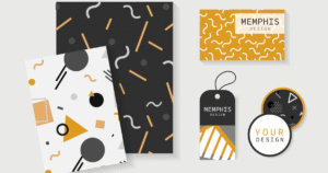
🎨 Black – Luxury, sophistication, power (popular in high-end brands like Chanel & Nike).
2. How to Choose the Right Color Scheme
✅ Understand your audience – Different cultures and demographics react to colors differently.
✅ Align with your brand personality – A tech startup may choose blue for trust, while an organic brand may prefer green for freshness.
✅ Use contrast for readability – High contrast between background and text enhances readability in digital and print designs.
✅ Stay consistent – Using a consistent color palette across all branding materials strengthens brand recognition.
3. DalilakKom: Your Partner in Professional Design
At DalilakKom, we understand the psychology behind color choices and how they influence branding. Our expert designers create custom logos, marketing materials, and branding guides tailored to your vision.
🎨 Transform Your Brand with the Right Colors!
Let our team help you craft visually stunning designs that resonate with your audience. Contact us today to start your colorful branding journey!


Add comment